- WE CHOSE
- THIS ONE


TASK
The Missile Armament Corporation turned to us to completely restyle the brand.
Our goal was to make the company look more presentable in the international exhibitions.
SOLUTION

For the logo, we used a silhouette of a missile overcoming an obstacle.
The image has at least two meanings:
1. The missile exceeds the speed of sound and creates a shockwave.
2. The missile goes through the enemy armor.
The broken lines that form the silhouette reflect the high technologies used by the armament corporation and invisibility for the hostile systems.
BRANDED
PATTERN
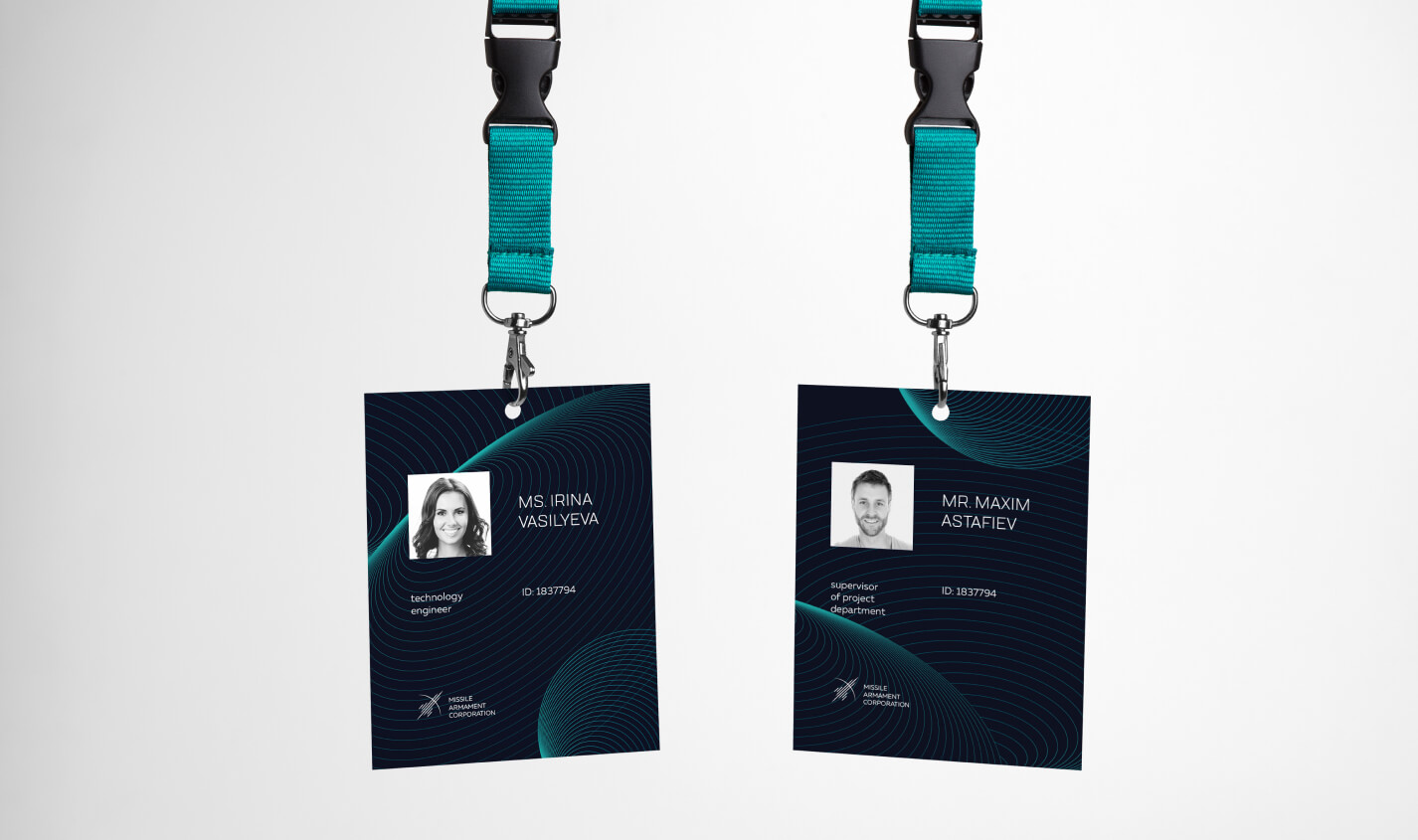
The main element of the design is the pattern, which, like a logo, involves several meanings: the flight trajectories, horizontals in the map, impact zone radiuses.


In the mock-ups you can see how well the new style of the brand matches the atmosphere of the work and adjusts for any kind of platforms.


Команда


