
A no-name firefighting equipment company turned to us, so-o-o... what did we have to do?
Everything! Competition analysis, naming, logo, brand style, site.
Let’s see the result!
#брендинг
We got total creative freedom but… As we all know, you can neither turn the Earth upside down nor make a brand from the scratch, unless you have a starting point. So, we started from the search for associations.
The client chose English- and German-speaking Europe as its primary target market. That was the first obstacle for us to overcome, because, as we all know, what is good for Russian, that is «oh mein Gott, warum so traurig?» for a European.
Unlike the pragmatic Russians, the Europeans have an interest for the emotional component of the brand as well. Going with a powerful idea of confrontation between the ice and fire, as the name we chose a Latin-transliterated Russian word — «NUST» («ice crust» in Russian).
MODERN


VISUAL
Now, when we had a name, we decided to use it for the further work. We based the logo on the visual metaphor: ice barrier holding back the flames.

The signal tape around the incident scene became a framing for the packages and business cards. This is an integral part of the whole style.
Bright red colouring of the package is used to draw attention. Also it creates a direct association with the elder brother – classic fire extinguisher.


The key feature of the NUST production was portability and ease of use. That’s why the package also has to be mobile, convenient and clear, with a readable label.
We developed 3 lines of production, for different aims and scenarios of usage.
Ready! Steady! Go!

— these are mobile fire extinguishers thrown into the fire point of origin


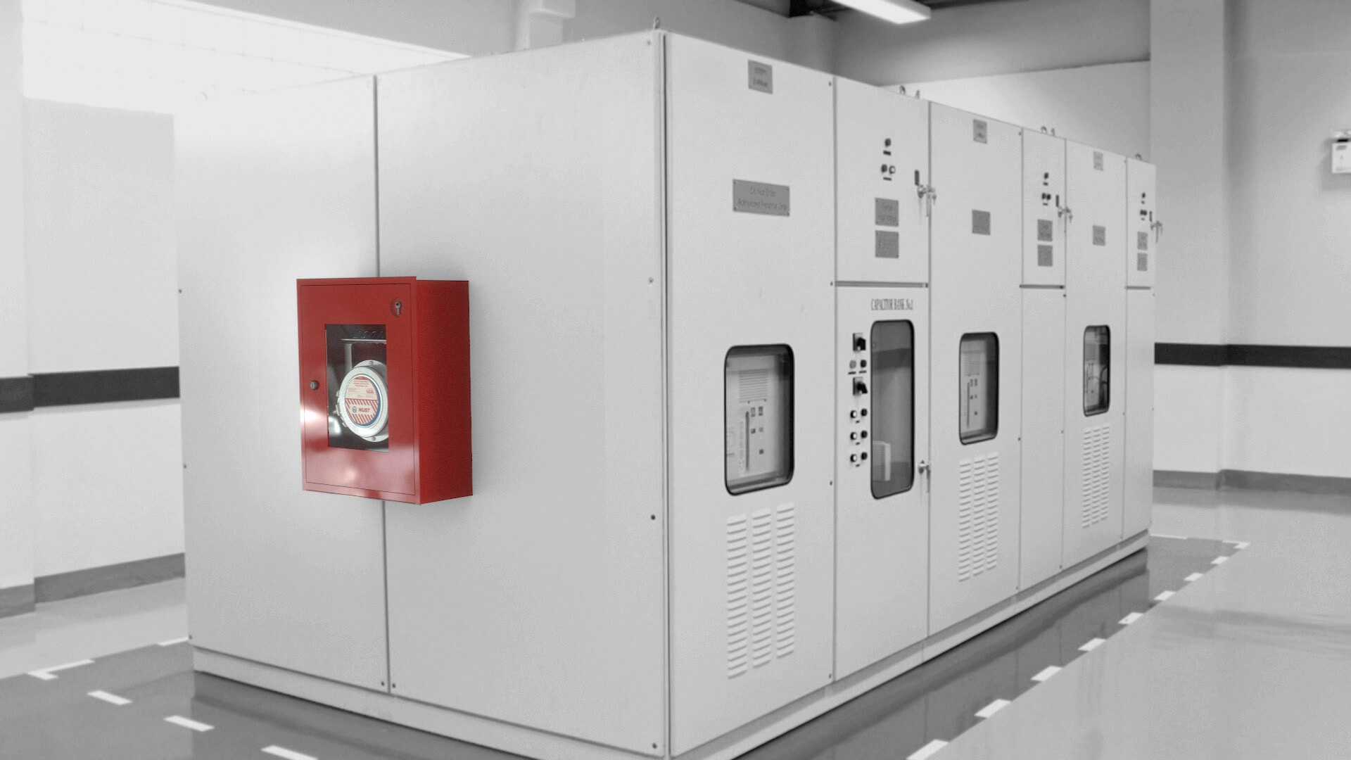
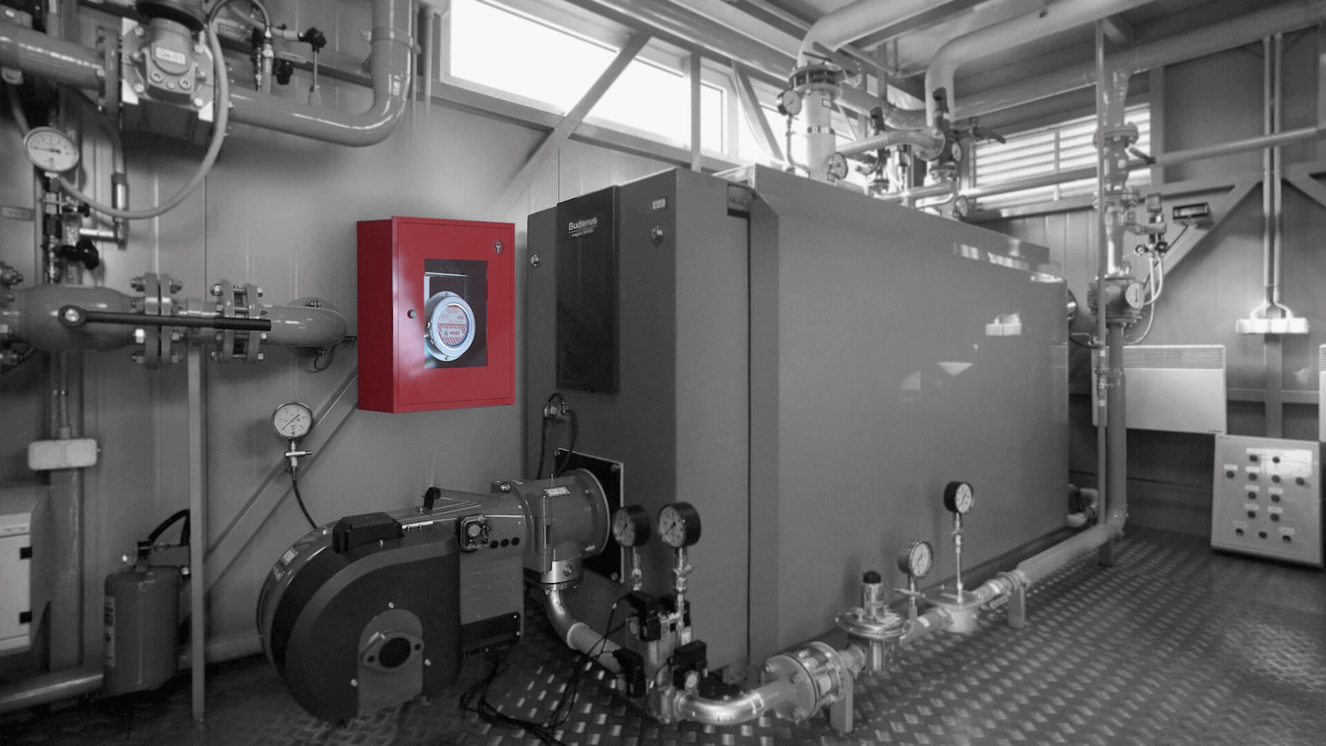
— this category includes fire-extinguishing stationary systems


— this is a portable fire extinguisher you can carry around or keep in your car
NUST IS AN
EFFECTIVE WAY TO
EXTINGUISH
FIRE


ON THE GUARD


Команда